
It is one of the first real decisions you will make about a piece, and it shapes everything that follows — the mood, the references your artist reaches for, the way it sits on your skin, and how it carries the years. Colour or black-and-grey is not a question of which is better. Both are complete, beautiful languages in their own right, and the best version of your idea usually lives clearly in one or the other. The trick is knowing which, and why. Here is how we think it through with people in the chair on Chapel Street.
What each approach actually does
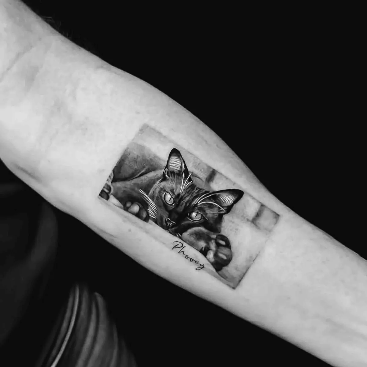
Black-and-grey is built entirely from black ink, diluted and layered to create the full range from deep shadow to soft, smoky grey. It leans on contrast, tone and gradient to do its work, which is why it reads as quiet, timeless and a little cinematic. Realism portraits, fine botanicals, religious and fine-art pieces, and a great deal of classic flash all live comfortably here.
Colour brings pigment into the picture — saturated, vivid and capable of a mood black ink simply cannot reach. A neo-traditional rose, a watercolour wash, a bright Japanese sleeve, a piece that needs the warmth of skin tones or the punch of a red: these come alive in colour. It tends to feel bolder and more energetic, and it draws the eye from across a room.
Neither is the “serious” choice and neither is the “fun” one — they are two ways of telling the same story, each with its own voice.
Match it to the mood you are after
Start with feeling rather than rules. Black-and-grey has a restraint to it — understated, moody, the kind of piece that reveals itself slowly. It suits subjects with weight: a portrait of someone you love, a memorial, an architectural or realist study where the drama is in light and shadow.
Colour, by contrast, is celebration. If your idea is playful, vibrant, or rooted in a tradition that lives in colour — old-school Americana, Japanese irezumi, a flower whose whole point is its hue — then stripping it back to grey would quietly remove what makes it sing. A good way to test yourself: picture the finished piece in your mind and notice whether colour is doing essential work or just decorating. If the design leans on a particular colour to mean what it means, that is your answer.
How your skin tone factors in
Your skin is the canvas, and it is never a blank white page — it carries its own undertone, and ink sits within it rather than on top. This matters more for colour than for black-and-grey. Black reads clearly on nearly every skin tone, which is part of why black-and-grey is so dependable across the board. Bright and pastel colours, on the other hand, are filtered by the warmth or depth of your skin, so the same pigment can land slightly differently from one person to the next.
This is not a limit so much as something to design around. On deeper or warmer skin, bold, high-saturation colours and strong outlines tend to read best, while very pale or delicate pastels can soften. A good artist will steer your palette to what will genuinely hold and glow on you, rather than what looked vivid on someone else's arm online. It is one of the most useful conversations to have at your consultation — bring it up early.
How each ages over the years
Permanence cuts both ways here, and it is worth being honest about. Black-and-grey is the more forgiving traveller. Black ink is dense and stable, so as a tattoo settles and softens over the decades it tends to hold its read — a well-made black-and-grey piece at twenty years still looks like itself, just gently mellowed.
Colour can be every bit as long-lasting, but some pigments are more demanding. Certain bright tones — particularly the lighter, more delicate ones — may soften sooner than a solid black, and may benefit from a refresh further down the track. This is not a reason to avoid colour; it is a reason to commit to it properly. Choose strong, well-saturated tones, let a skilled hand pack them solidly, and protect them. The single biggest factor in how any tattoo ages, colour or not, is sun exposure — and the Australian sun is unforgiving. Diligent sunscreen does more to keep a piece crisp than almost anything else, as our guide to how tattoos age goes into.
A tattoo is a living thing on living skin — choose it for the long view, then care for it like one.
Cost, sittings and what to expect
Colour often asks for a little more time, and time is what tattooing is priced on. Packing solid, even colour — and layering tones so they blend cleanly — can take longer than the equivalent in grey, and larger colour pieces are sometimes split across more than one sitting to let the skin settle in between. Black-and-grey of the same size will frequently come together more quickly.
None of this should drive the decision on its own. A piece you chose for budget rather than for what it wanted to be is the kind of thing people quietly wish they had done differently. Far better to pick the right language for your idea, then plan the sittings around it. Every quote is set individually by your artist once they have seen the design, the size and the placement — the figures here are a guide only, never a fixed price.
Can you combine the two?
You can, and it is one of the most striking things in the medium when it is done with intent. A predominantly black-and-grey piece with a single deliberate hit of colour — one red rose in a grey bouquet, a flash of gold in an otherwise monochrome design — can be far more powerful than either alone, precisely because the eye knows exactly where to land. The key word is intent: the colour should be a decision, not an afterthought. Mixed within a larger composition, such as a sleeve, the two can also be zoned, with colour sections and grey sections planned to balance the whole. That kind of planning is exactly what a thoughtful design conversation is for.
So, how do you decide?
Lead with the idea, not the trend. Ask what your piece is trying to feel like, whether colour is doing essential work or simply sitting on top, and how you want it to read in twenty years rather than twenty days. Bring your references — both the ones you love and the ones you do not — and let your artist tell you honestly where your design lives most naturally. More often than not the right answer is already clear once it is said out loud; our part is to confirm it and then build it properly.
If you are still weighing the broader question of which direction suits you, our beginner's guide to choosing a style is a good companion to this one. And whichever way you lean, the care afterwards is the same: follow your artist's aftercare, keep it out of the sun, and if a healing tattoo ever shows signs of infection — spreading redness, heat, swelling or pus — see a doctor. Everything else is just letting good ink settle into good skin.